Communicating numbers
maartenlambrechts.com
Do's and dont's
Inform EU Conference
15 November 2023
Maarten
Lambrechts
Disclaimer
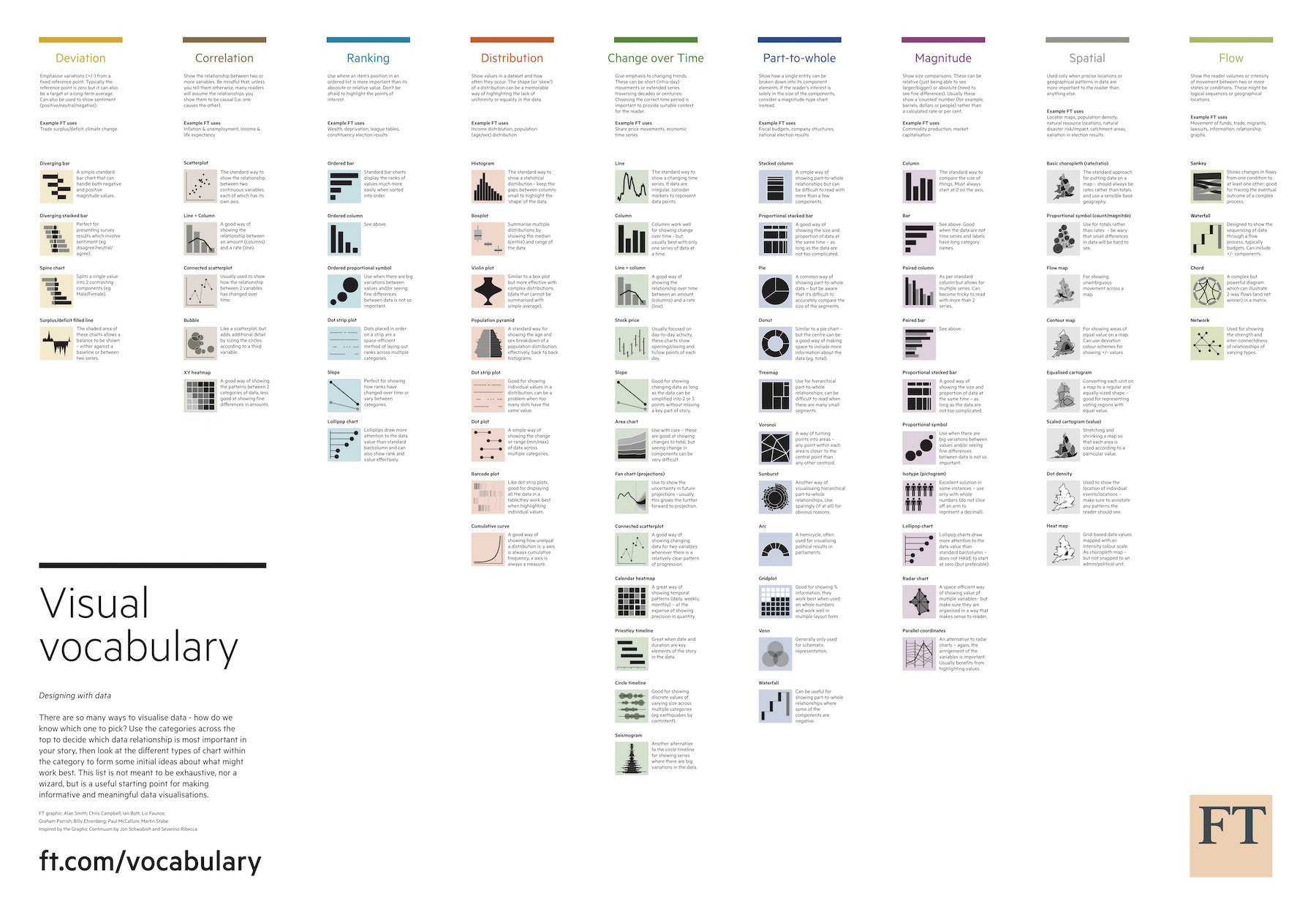
Text vs chart vs table


Text for explanations
Charts for patterns in the data
Tables for looking up values
Chart design


Avoid 3D
1 chart, 1 message
Horizontal bars for horizontal labels
Appropriate chart types have a clearer message
Layout


Align visualizations in your publication
Don't use borders
Offer enough resolution
Structure


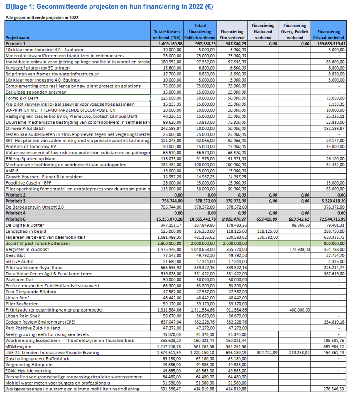
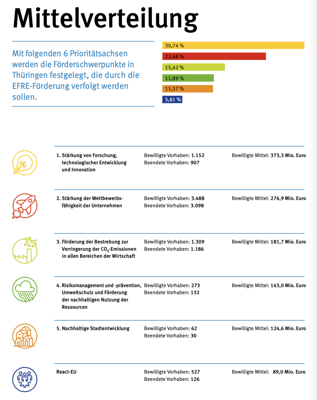
Overview with key numbers
Zoom for interesting patterns
Examples and details on demand
Make it relatable


Translate to relatable numbers
Show geography
Use pictures
Put in people
Give fun details
Color




Ensure enough contrast
Go beyond the defaults
Make it colour blind safe
Formatting


Round numbers
Simplify urls
Table design


Align numbers right
Align text left
Remove borders or make them subtle
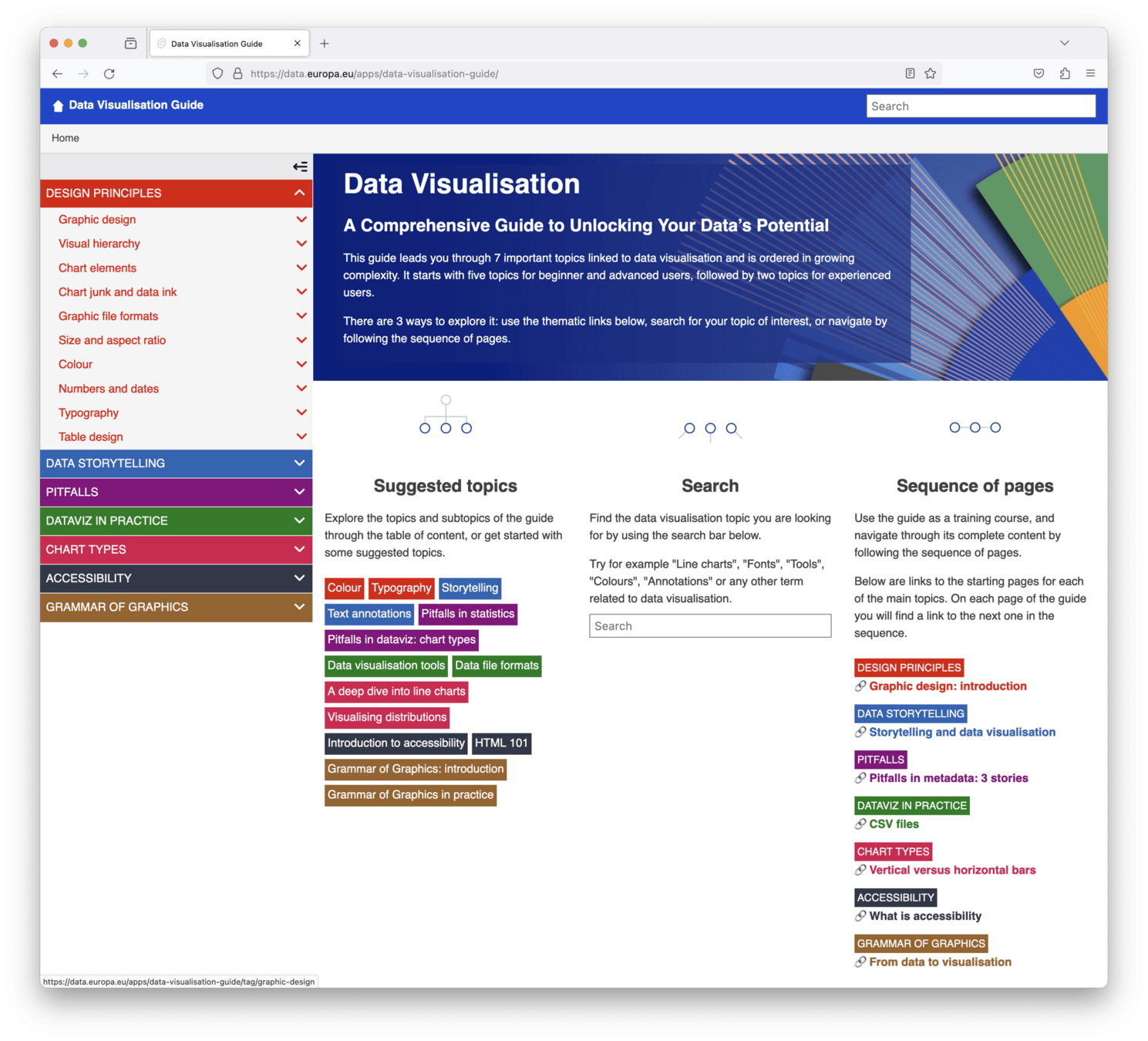
Resources
Text vs chart vs table
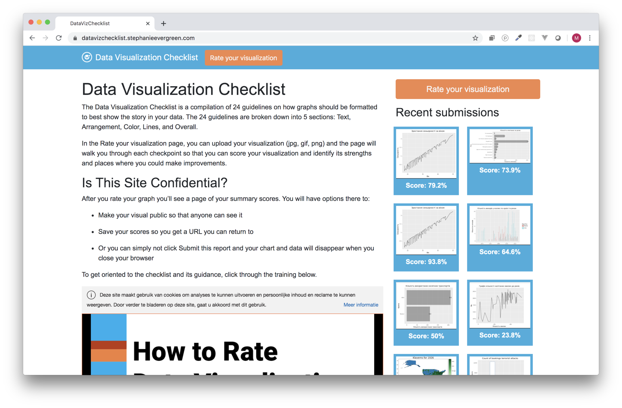
Chart design
Layout
Structure
Make it relatable
Colour
Formatting
Make it easy for your audience
Assignment
Pick a target audience and a fitting publication format, summarise the Cohesion Policy numbers for the target audience
Submissions should
- have 1 clear message
- have at least 1 data visualisation
- relate to the target audience
- reference at least 1 project and show how that relates to the general policy
Duration: 60 minutes. Drafts and rough sketches are ok
Submit in person or via informeu@ec.europa.eu
Thanks!
Communicating numbers: do's and dont's
By maartenzam
Communicating numbers: do's and dont's
- 4,092
