Implementing motion using Vue
Gerard Sans | @gerardsans

Google Developer Expert
Google Developer Expert
International Speaker

Spoken at 97 events in 26 countries

Blogger
Blogger
Community Leader

900
1.5K
Trainer
Master of Ceremonies

Master of Ceremonies


Why introduce motion?
Improved UX ✨

Perceived Performance
Immersive interactions

Better engagement

User happiness 😃

Animation Principles
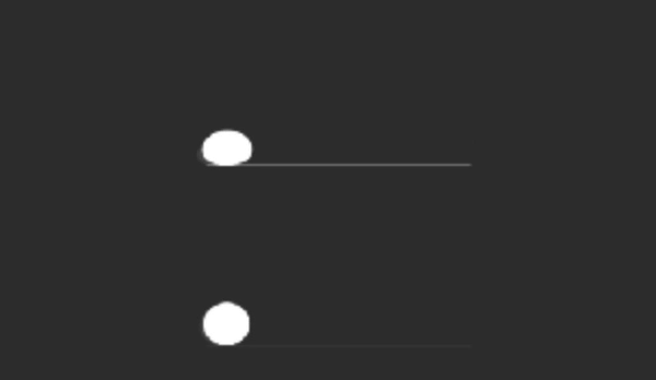
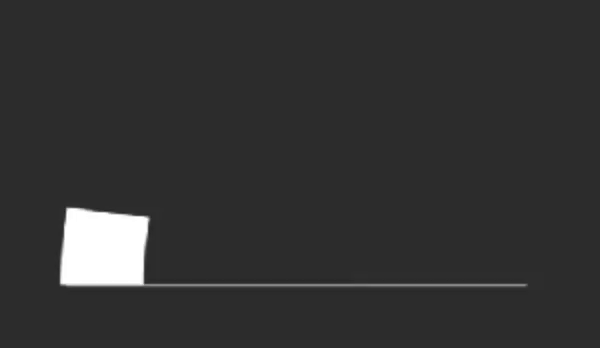
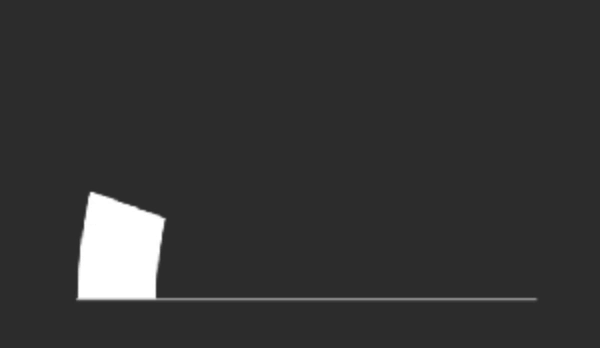
Squash & Stretch + Anticipation
Follow through
Exaggeration
Composition
Motion Design
Principles
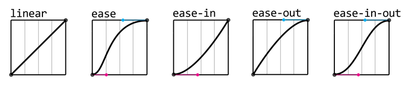
Easing


Offset Delay

Parenting

Binding Values
Overlay

CSS Transitions

DURATION
opacity: 0;
opacity: 1;
CSS Transitions
PROPERTY
transition: opacity 1s ease-in 1s;
DURATION
TIMING
DELAY
timing function/easing
Fade
<div class="container">
  <div class="circle base elastic"></div>
</div>

.circle {
  border-radius: 50%;
  position: absolute; opacity:0;
  will-change: opacity, transform;
}
.base {
  transition: opacity 1s ease,
   transform 1s ease;
}
.elastic {
  transition-timing-function:
   cubic-bezier(.8,-0.6,0.2,1.5);
}
.container:hover .circle {
  transform: translateX(80px);
  opacity:1;
}
Fade
Animatable CSS
all background* border* bottom box-shadow clip clip-path color filter font* height left margin* mask* offset* opacity outline* padding* perspective* right text-decoration text-shadow top transform vertical-align visibility width z-index
CSS Animations
DURATION
CSS Animations
0%
100%
KEYFRAMES
NAME
animation: fade 1s 1s infinite linear;
DURATION
DELAY
ITERATIONS
TIMING
Fade

<div class="circle base elastic"></div>

.base {
  animation: fade 2s infinite;
}

@keyframes fade {
  0% {
    transform: translateX(0px);
    opacity: 0;
  }
  40%, 60% {
    transform: translateX(80px);
    opacity: 1;
  }
  100% {
    transform: translateX(0px);
    opacity: 0;
  }
}
Animations Performance
60 FPS
Smooth 60FPS
60 FPS
Time
16.66ms
16.66ms
16.66ms
1000/60ms
paint
frame
paint
frame
paint
frame
😃
paint
frame
paint
frame
Losing Frames!
60 FPS
Time
16.66ms
16.66ms
16.66ms
😱
Motion Techniques
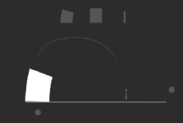
Move
transform: translateX(10px);
Resize
transform: scale(0.5);
Rotate
transform: rotate(1turn);
Fade
opacity: 0;

Move
<div class="circle base elastic"></div>

.base {
  animation: move 2s infinite;
}
.elastic {
  animation-timing-function:
    cubic-bezier(.8,-0.6,0.2,1.5);
}

@keyframes move {
  0% {
    transform: translateX(-250px);
  }
  40%, 60% {
    transform: translateX(50px);
  }
  100% {
    transform: translateX(250px);
  }
}
Rotate
<div class="square base linear"></div>

.base {
  animation: spin 2s infinite;
}
.linear {
  animation-timing-function: linear;
}

@keyframes spin {
  to {
    transform: rotate(1turn);
  }
}
Resize
<div class="circle base"></div>

.base {
  animation: size 2s infinite;
}

@keyframes size {
  0%, 40%, 100% {
    transform: scale(1);
  }
  25%, 60% {
    transform: scale(1.1);
  }
}
Vue Animations
.fade-in
.fade-out
Fading using CSS classes
opacity: 1
opacity: 0
transition: opacity 1s;
.fade
show/hide
<template>
  <div class="box" @click="show=!show">
    <div class="circle fade"
      :class="show?'fade-in':'fade-out'"></div>
  </div>
</template>
<script>
export default {
  data() {
    return {
      show: false
    };
} }
</script>
src/app.component.ts
Fading using CSS classes
src/App.vue
<style>
.fade {
  transition:
   opacity 400ms cubic-bezier(.8,-0.6,0.2,1.5),
   transform 400ms cubic-bezier(.8,-0.6,0.2,1.5);
}
.fade-in {
  opacity: 1;
  transform: translateX(80px);
}
.fade-out {
  opacity: 0;
}
</style>
src/app.component.ts
Fading using CSS classes
src/App.vue
- Transition Hooks
- before
- enter/leave
- after
- cancelled
- JS libs
- Transition Classes
- enter/leave
- active
- to
- CSS libs
CSS
JS
Transitions Classes
enter/leave
v-leave
v-leave-active
v-leave-to
v-enter
v-enter-active
v-enter-to
opacity:0
opacity:1
setup
setup
DOM added
DOM removed
raf
raf
opacity:0
opacity:1
<template>
  <div class="box" @click="show=!show">
    <transition name="fade">
      <div class="circle" v-if="show"></div>
    </transition>
  </div>
</template>
<script>
export default {
  data() {
    return {
      show: false
    };
</script>
src/app.component.ts
Using vue CSS transitions
src/App.vue
<style>
.circle {
  transform: translateX(80px);
}
.fade-enter, .fade-leave-to {
  opacity: 0;
  transform: translateX(-80px);
}
.fade-enter-active, .fade-leave-active {
 transition: opacity 400ms cubic-bezier(.8,-0.6,0.2,1.5),
   transform 400ms cubic-bezier(.8,-0.6,0.2,1.5);
}
.fade-enter-to, .fade-leave {
  opacity: 1;
}
</style>
src/app.component.ts
Using vue CSS transitions
src/App.vue
- Transition Hooks
- before
- enter/leave
- after
- cancelled
- JS libs
- Transition Classes
- enter/leave
- active
- to
- CSS libs
CSS
JS
<template>
  <div class="box" @click="show=!show">
    <transition name="fade" :css="false"
      @enter="fadeIn" @leave="fadeOut">
      <div ref="circle" class="circle" v-if="show"></div>
    </transition>
  </div>
</template>
<script>
export default {
  methods: {
    fadeIn: function(el, done){ ... },
} };
</script>
src/app.component.ts
Using JS hooks
src/App.vue
fadeIn: function(el, done) {
  const animation = this.toggle(el, 0, 1);
  animation.onfinish = done;
},
toggle: function(el, from, to){
  const start = from?80:0;
  const end = from?0:80;
  return el.animate([
    { opacity: from, transform: `translateX(${start}px)` },
    { opacity: to, transform: `translateX(${end}px)` }
   ], {
     duration: 400, fill: "both",
     easing: 'cubic-bezier(.8,-0.6,0.2,1.5)'
   });
}
src/app.component.ts
Using JS hooks
src/App.vue

source: blog
Applying
Motion


Example
List Example
<div class="buttons-container">
  <button @click="add()">+</button>
  <button @click="remove(0)" :disabled="list.length===0">-</button>
</div>
<div class="list-container">
  <transition-group name="list">
    <div class="box"
      v-for="(item, index) in list"
      :key="item">
    </div>
  </transition-group>
</div>
src/app.component.ts
Animating new items
src/App.vue
.list-enter-to
Animating new items
scale(1)
opacity 1
scale(0.5)
opacity 0
.list-enter
.list-enter-active
add
<style>
.list-enter {
  transform: scale(0.5);
  opacity: 0;
}
.list-enter-to {
  transform: scale(1);
  opacity: 1;
}
.list-enter-active {
  transition: transform 1s cubic-bezier(0.8,-0.6,0.2,1.5),
    opacity 1s cubic-bezier(0.8,-0.6,0.2,1.5);
}
</style>
src/app.component.ts
New items transitions
src/App.vue
Animating removed items
STATE
STATE
scale(0.5)
opacity 0
scale(1)
opacity 1
.list-leave-active
remove
.list-leave-to
.list-leave
<style>
.box.list-leave {
  transform: scale(1); opacity: 1;
  height: 50px; margin: 5px;
}
.box.list-leave-to {
  transform: scale(0.5); opacity: 0;
  height: 0px; margin: 0px;
}
.list-leave-active {
  transition: transform 1s cubic-bezier(0.8,-0.6,0.2,1.5),
    opacity 1s cubic-bezier(0.8,-0.6,0.2,1.5),
    height 1s cubic-bezier(0.8,-0.6,0.2,1.5),
    margin 1s cubic-bezier(0.8,-0.6,0.2,1.5);
}
</style>
src/app.component.ts
Removed items transitions
src/App.vue
Stagger
time
<div class="list-container">
  <transition-group name="list"
    appear @appear="this.stagger = true">
    <div class="box"
      v-for="(item, index) in list" :key="item"
      :style="this.stagger?null:{transitionDelay: index*300+'ms'}">
    </div>
  </transition-group>
</div>
src/app.component.ts
Stagger initial render
src/App.vue
More
Influencers


David Khourshid
Issara Willenskomer
Sarah Drasner

Rachel Nabors