Mastering Angular Animations v7+

Mastering Angular Animations v7+


Gerard Sans
@gerardsans
Gerard Sans
@gerardsans
SANS
GERARD
Google Developer Expert

Google Developer Expert
International Speaker

Spoken at 111 events in 27 countries

Blogger
Blogger
Community Leader

900
1.6K
Trainer

Master of Ceremonies

Master of Ceremonies


#cfpwomen

Why introduce motion?
Improved UX ✨

Perceived Performance


Immersive interactions

Better engagement

User happiness 😃

Animation Principles
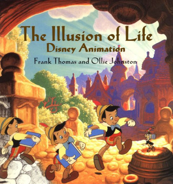
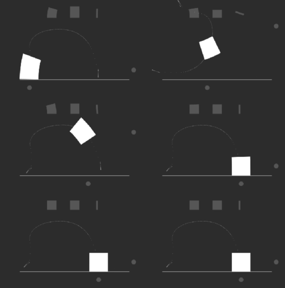
Squash & Stretch + Anticipation

Follow through

Exaggeration

Composition
Motion Design
Principles
Easing


Offset Delay

Parenting

Binding Values

Overlay

CSS Transitions

DURATION
opacity: 0;
opacity: 1;
CSS Transitions
PROPERTY
transition: opacity 1s ease-in 1s;
DURATION
TIMING
DELAY


timing function/easing
Fade
<div class="container">
  <div class="circle base elastic"></div>
</div>

.circle {
  border-radius: 50%;
  position: absolute; opacity:0;
  will-change: opacity, transform;
}
.base {
  transition: opacity 1s ease,
   transform 1s ease;
}
.elastic {
  transition-timing-function:
   cubic-bezier(.8,-0.6,0.2,1.5);
}
.container:hover .circle {
  transform: translateX(80px);
  opacity:1;
}
Fade
Animatable CSS
all background* border* bottom box-shadow clip clip-path color filter font* height left margin* mask* offset* opacity outline* padding* perspective* right text-decoration text-shadow top transform vertical-align visibility width z-index
CSS Animations


DURATION
CSS Animations
0%
100%
KEYFRAMES
NAME
animation: fade 1s 1s infinite linear;
DURATION
DELAY
ITERATIONS
TIMING
Fade

<div class="circle base elastic"></div>

.base {
  animation: fade 2s infinite;
}

@keyframes fade {
  0% {
    transform: translateX(0px);
    opacity: 0;
  }
  40%, 60% {
    transform: translateX(80px);
    opacity: 1;
  }
  100% {
    transform: translateX(0px);
    opacity: 0;
  }
}
Animations Performance
60 FPS
Smooth 60FPS
60 FPS
Time
16.66ms
16.66ms
16.66ms
1000/60ms
paint
frame
paint
frame
paint
frame
😃
paint
frame
paint
frame
Losing Frames!
60 FPS
Time
16.66ms
16.66ms
16.66ms
😱
Motion Techniques
Move
transform: translateX(10px);
Resize
transform: scale(0.5);
Rotate
transform: rotate(1turn);
Fade
opacity: 0;

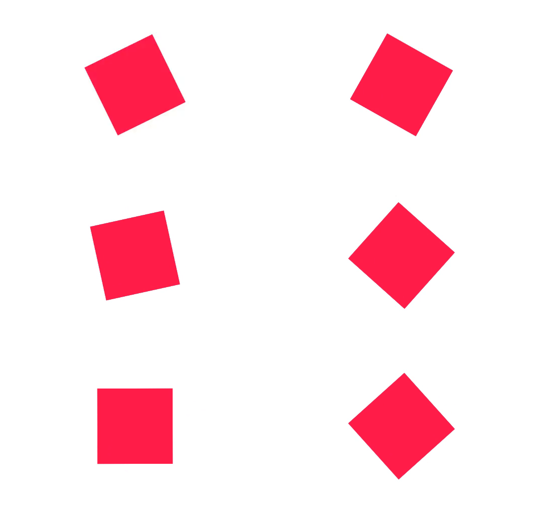


Move

<div class="circle base elastic"></div>

.base {
  animation: move 2s infinite;
}
.elastic {
  animation-timing-function:
    cubic-bezier(.8,-0.6,0.2,1.5);
}

@keyframes move {
  0% {
    transform: translateX(-250px);
  }
  40%, 60% {
    transform: translateX(50px);
  }
  100% {
    transform: translateX(250px);
  }
}
Rotate

<div class="square base linear"></div>

.base {
  animation: spin 2s infinite;
}
.linear {
  animation-timing-function: linear;
}

@keyframes spin {
  to {
    transform: rotate(1turn);
  }
}
Resize

<div class="circle base"></div>

.base {
  animation: size 2s infinite;
}

@keyframes size {
  0%, 40%, 100% {
    transform: scale(1);
  }
  25%, 60% {
    transform: scale(1.1);
  }
}
Angular Animations
States & Transitions
fadeIn
fadeOut
Fading animation
TRANSITIONS
STATE
STATE
fadeIn => fadeOut
fadeOut => fadeIn
opacity: 1
opacity: 0
animate('400ms linear')
animate('400ms linear')
fadeOut <=> fadeIn
animate('400ms linear')
Fading an Element
import {fade} from './animations';

@Component({
  selector: 'my-app',
  template: `<button [@fade]='fade' (click)="toggleFade()">Fade</button>`,
  animations: [ fade ]
})
export class App {
  fade = 'fadeIn';
  toggleFade(){
    this.fade = this.fade === 'fadeIn' ? 'fadeOut' : 'fadeIn';
  }
}
Fading Animation
import {
  trigger, transition, state, style, animate
} from '@angular/animations';

export const fade = trigger('fade', [
  state('fadeIn', style({ opacity: 1 })),
  state('fadeOut', style({ opacity: 0 })),
  transition('fadeIn <=> fadeOut', animate('400ms linear'))
]);
Applying
Motion


Example
Adding Motion
void
*
Animating new items
void => *
STATE
STATE
:enter
scale(1)
opacity 1
scale(0.5)
opacity 0
*
void
Animating removed items
* => void
STATE
STATE
:leave
scale(0.5)
opacity 0
scale(1)
opacity 1
Execution Order
sequence
group
time
Dynamic Selectors
class="container"
class="item"
class="item"
query(selector)
Dynamic Selectors
query('.item')
class="container"
class="item"
class="item"
Dynamic Selectors
query('.item:enter')
class="container"
class="item"
class="item"
class="item"
added
Composition
animateChild
time
Stagger
time
Reactive Animations
Introduction
- React to user interactions
- Maps user input to CSS
- mouse position, keyboard, scroll, input field
- Static or dynamic
Technologies
- Animations
- CSS, canvas, WebGL, SVG
- AnimationBuilder
- Player
- Events
- RxJS
Dynamic Animations
Builder
`(${x}, ${y})`
(100, 50)
Player
Template
1
2
(100, 50)
3
build()
play()
AnimationBuilder
import {AnimationBuilder} from "@angular/animations";
export class MyComponent {
  constructor(
    private elem: ElementRef,
    private builder: AnimationBuilder
  ) {
    const player = this.playerMoveTo({ x: 100, y: 100 });
    player.play();
  }
  playerMoveTo(to) {
    const moveAnimation = this.builder.build([
      animate('1s', style({ transform: `translate(${x}px, ${y}px)` }))
    ]);
    return moveAnimation.create(this.elem.nativeElement
      , {params: { x: to.x, y: to.y }});
  }
}
Tracking mouse position
constructor(
  private elem: ElementRef
) {
  // find out center
  this.mx = elem.nativeElement.offsetWidth/2;
  this.my = elem.nativeElement.offsetHeight/2;
}

ngOnInit() {
  const mouseMove$ = fromEvent(document, 'mousemove')
    .pipe(map(e => ({ x: e.pageX, y: e.pageY })));

  mouseMove$.subscribe({
    next: e => {
      this.lastPosition = { x: e.x-this.mx, y: e.y-this.my };
      const player = this.playerMoveTo(this.lastPosition);
      player.play();
    }
  })
}
More
Influencers


David Khourshid
Issara Willenskomer
Sarah Drasner

Rachel Nabors



Mastering Angular Animations (v7+)
By Gerard Sans
Mastering Angular Animations (v7+)
How we can use Animations in Angular. We will cover Web Animations API and how we can use Angular together with field-tested animation techniques providing examples for CSS transitions/animations and SVG. We will also study browser compatibility and performance to achieve reliable and smooth animations. Let's bring our Angular skills to the awesome world of animations!
- 5,698


