gsap.to(".ball", {
 y: 150,
 duration: 3,
 yoyo: true,
 repeat: -1,
 ease: "sine.inOut"
});
gsap.to(".ball", {
keyframes: {
"0%": { yPercent: 0, scaleX: 1, scaleY: 1 },
"7%": { yPercent: 5, scaleY: 0.9, scaleX: 1.1 },
"25%": { yPercent: 100, scaleX: 0.9},
"50%": { yPercent: 500, scaleX: 1, scaleY: 1},
"60%": { scaleX: 1.6, scaleY: 0.4},
"65%": { yPercent: 500, scaleX: 1, scaleY: 1},
"100%": { yPercent: 0, scaleX: 1, scaleY: 1},
easeEach: "sine.out"
},
duration: 0.8,
repeat: -1,
transformOrigin: "center bottom"
});


@keyframes nope {
  from {background-image: url("candles.jpg")}
  to {background-image: url("moon.jpg")}
}
.container {
height: 20px;
transition: height 2s ease-in-out;
}
.container:hover {
height: calc-size(auto);
}
Coming soon?...
let tl = gsap.timeline()

tl.to("#lightning", {
  morphSVG:  "#circle"
})
.to("#lightning", {
  morphSVG:  "#star",
  scale: 0.6,
  rotation: 360,
  transformOrigin: "center center"
})
The web is an infinite and unknowable canvas.
- Miriam Suzanne
100vw
100lvh
700px
FIXED
relative
flexbox
absolute
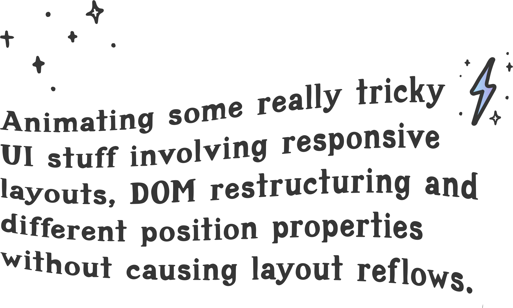
Sounds hard.
Why bother?
- people with better stuff to be doing

central
peripheral
peripheral
visual awareness
central
peripheral
peripheral
visual awareness

visual awareness
visual awareness

sneaky stuff
sneaky stuff
Inattentional blindness

Use motion to signal change
Change Blindness
Change Blindness


What about now?
I am a website

I am a new page
Exit
Entrance
Persistent
UI transitions
Vanishing
Appearing
Levitating
UI transitions

Layout > Paint > Composite

Layout > Paint > Composite


Layout > Paint > Composite


Layout > Paint > Composite

Layout > Paint > Composite
Layout > Paint > Composite
with a little bit of...
Magic
with
FLIP
F
L
I
P
irst
ast
nvert
lay

{
  top: 300,
  left: 900,
  width: 200,
  height: 500,
}
width
height
top
left
First
el.getBoundingClientRect(){
top: 10,
left: 200,
width: 500,
height: 1000,
}Last
Where the magic happens
Layout
Paint
Invert

translate(200px, 100px) scale(2.5)Play!
translate(0px, 0px) scale(1)const first = box.getBoundingClientRect();
switchItUp()
const last = box.getBoundingClientRect();
let delta = {
x: -1 * (last.left - first.left),
y: -1 * (last.top - first.top),
};
box.style.transform = `translate(${delta.x}px, ${delta.y}px)`;
requestAnimationFrame(function () {
el.classList.add("animate");
el.style.transform = "none";
});.animate {
transition: transform 1s ease-in-out;
}let state = Flip.getState(card);
switchItUp()
Flip.from(state)MAKE IT MORE IMPOSSIBLE!
EVEN MORE IMPOSSIBLE!
Sometimes you have to break the rules.
F
L
I
P
irst
ast
nvert
lay
F
L
O
P
irst
ast
ffset
arent
Any sufficiently advanced technology is indistinguishable from magic.
– Arthur C. Clarke
https://codepen.io/hexagoncircle
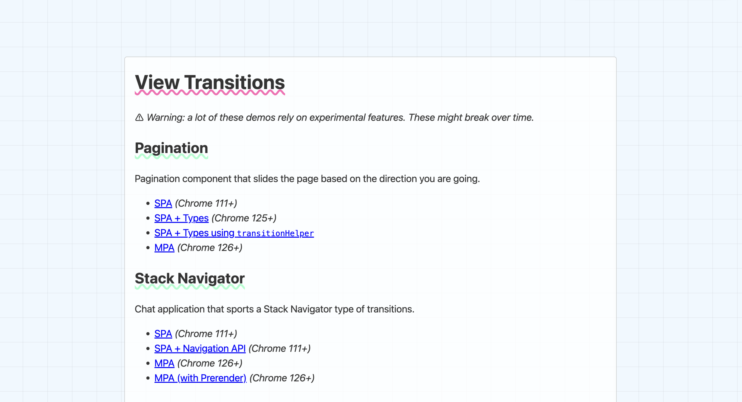
View Transitions!
View Transitions!
View Transitions!
.card {
 view-transition-name: card;
}

::view-transition-group(card) {
 animation-duration: 2s;
}
document.startViewTransition(() => reparentCard());View Transitions!
#card1 {
 view-transition-name: card1;
}
#card2 {
 view-transition-name: card2;
}
#card3 {
 view-transition-name: card3;
}
#card4 {
 view-transition-name: card4;
}

::view-transition-group(card1),
::view-transition-group(card2),
::view-transition-group(card3),
::view-transition-group(card4),{
 animation-duration: 2s;
 animation-timing-function: ease-out
}
view-transition-class
#card1 {
 view-transition-name: card1;
}
#card2 {
 view-transition-name: card2;
}
#card3 {
 view-transition-name: card3;
}
#card4 {
 view-transition-name: card4;
}

.card {
 view-transition-class: card;
}
::view-transition-group(.card) {
 animation-duration: 2s;
 animation-timing-function: ease-out
}
Enter and Exit animations
::view-transition-new
::view-transition-old
@keyframes animate-out {
  0% {
    opacity: 1;
    translate: 0 0;
  }
  100% {
    opacity: 0;
    translate: 0 -200px;
  }
}

@keyframes animate-in {
	0% {
    opacity: 0;
    translate: 0 -200px;
  }
	100% {
    opacity: 1;
    translate: 0 0;
  }
}
/* Card was added */
::view-transition-new(targeted-card):only-child {
animation: animate-in ease-in 0.25s;
}
/* Card is getting deleted */
::view-transition-old(targeted-card):only-child {
animation: animate-out ease-out 0.5s;
}Same document view transitions
@view-transition {
  navigation: auto;
}
Woop woop! View transitions

@media (prefers-reduced-motion: no-preference) {
  /* safe to animate */
}
use your magical powers responsibly
use your magical powers responsibly
let mm = gsap.matchMedia()

mm.add("(prefers-reduced-motion: no-preference)", (context) => {
   ...
);
The End
