Tailwind
🍋 Lemoncode Workshop
Es necesario conocer la tecnología para saber sus pros y contras
Introducción
¿Qué es TailwindCSS?
Tailwind CSS es un framework de CSS basado en utility-first
Clases de bajo nivel
Aplican estilos específicos
class="clear-left"<div class="flotante-izquierda" style="float: left;">
Elemento flotante a la izquierda
</div>
<div class="flotante-derecha" style="float: right;">
Elemento flotante a la derecha
</div>
<div class="elemento-sin-flotante" style="clear: left;">
Elemento sin flotar
</div><div class="flex flex-col items-center gap-6 p-4">
<h1 class="text-3xl font-bold">Hola Mundo Tailwind</h1>
</div>Framework vs Librería
| Aspecto | Framework | Librería | Tailwind CSS |
|---|---|---|---|
| Nivel de control | Estructura y reglas claras | Tú decides cómo usarla | Te da control total sobre el diseño |
| Enfoque | Más amplio y general | Resolución de problemas específicos | Flexible y altamente personalizable |
| Ejemplo | Bootstrap | Animate.css | Framework utilitario sin estilos predefinidos |
Un framework CSS contiene estilos y funcionalidades predefinidas para "hacerte la vida más fácil".
¿Entonces no es lo mismo que Bootstrap?
¿Clases de utilidad?
Necesitas saber CSS
.title {
color: indigo;
font-size: 4rem;
text-align: center;
}.indigo {
color: indigo;
}
.font-xlarge {
font-size: 4rem;
}
.text-center {
text-align: center;
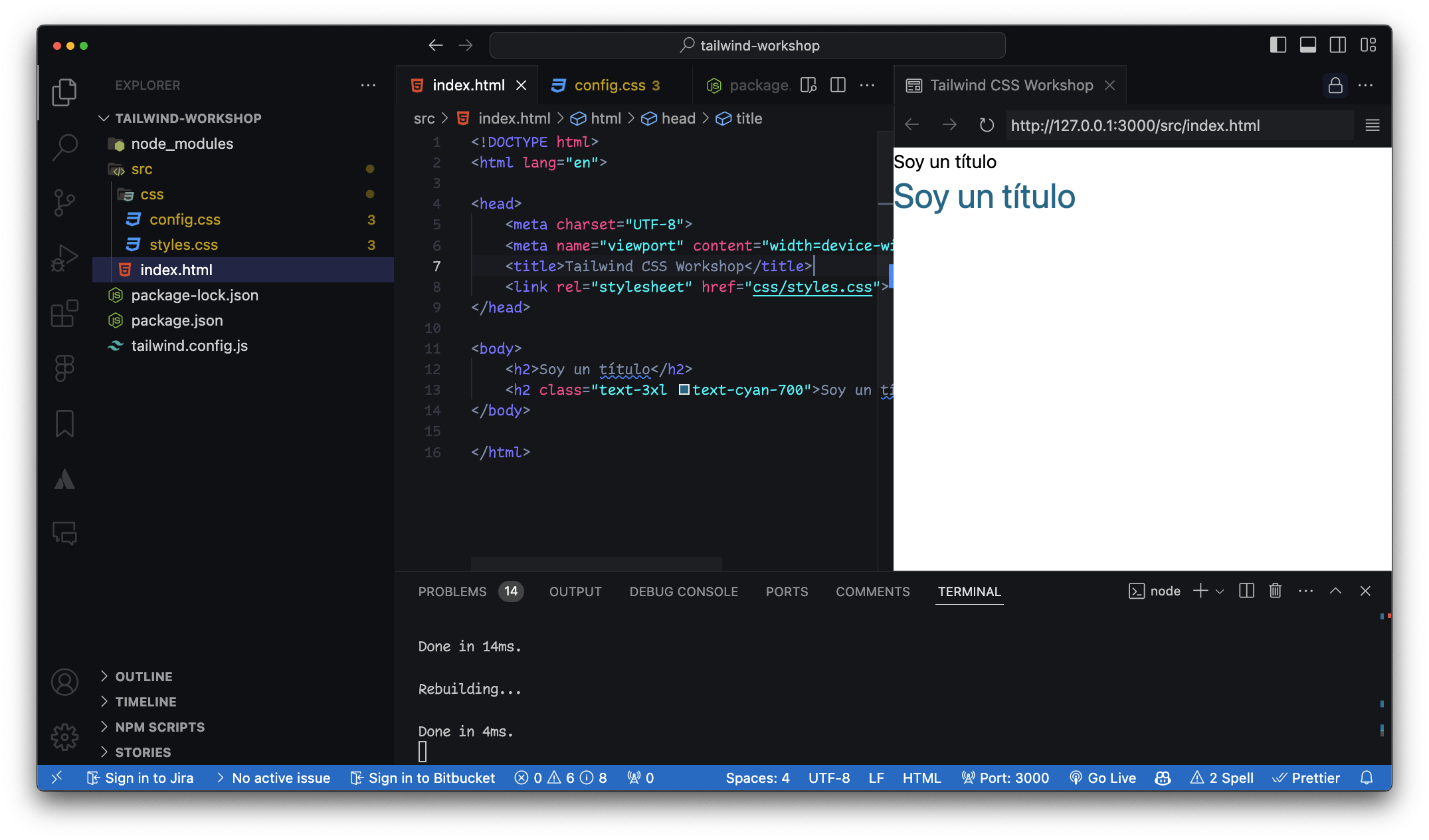
}<h2 class="title">Soy un título</h2>
<h2 class="indigo font-xlarge text-center">Soy un título</h2>/* style.css */
.btn {
background-color: blue;
color: white;
padding: 10px 20px;
border-radius: 5px;
}<!-- index.html -->
<button class="bg-blue-500 text-white py-2 px-4 rounded">
Button
</button>h2 con clases CSS y de utilidad
Botones animados
¿Ventajas?
Tienes establecidas clases de utilidad
¿Ventajas?
-
No necesitas pensar en nombres de clases.
-
Simplifica la arquitectura de CSS.
-
Facilita la creación y reutilización de estilos.
RWD
Mobile first
Fases de evolución
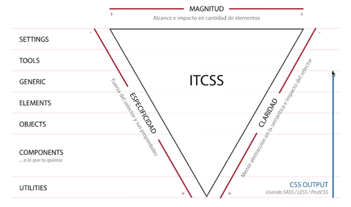
Enfoque CSS
1. CSS Semántico
.author-bio
2. Desacople con BEM
.author-bio__image
3. Componentes Agnósticos
.media-card
4. Clases Utilitarias
.text-center, .bg-white, p.-4
5. Utility-First
Consistencia - Reutilización - Eficiencia
Conclusión
Adam Watham
Conclusión
Carmen Ansio
Conclusión
Esto soluciona un problema, pero crea otro
Diferencia con
estilos en línea
<div class="flex flex-col items-center gap-6 p-4">
  <h1 class="text-3xl font-bold">Hola Mundo Tailwind</h1>
</div>gap-6Combinando clases vs
Componentes predefinidos
Ventajas de
Tailwind
CSS Utility First
Smart CSS
Plugins
DesVentajas de
Tailwind
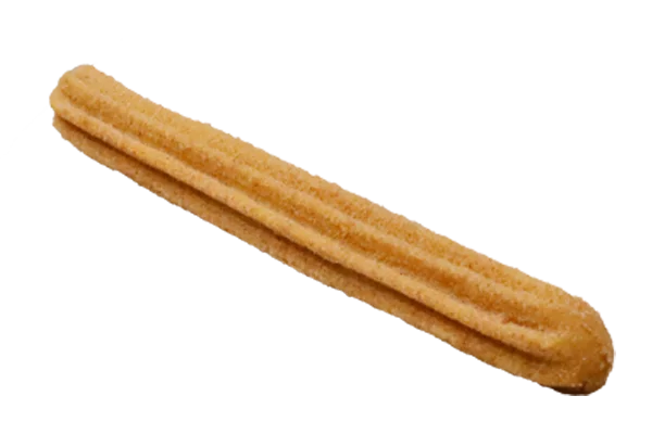
Churro Clases
Sin Bases
Adiós Semántica
Opciones para usar
Tailwind CSS
Opciones de instalación
Tailwind CLI - Play CDN - Online Playground / Codepen
Arrancando
Un proyecto
Extensiones para VSCode
Tailwind CSS IntelliSense - Live Preview
tailwind.config.js
Instalación Rápida
CDN ¿Qué es un CDN?
<script src="https://cdn.tailwindcss.com"></script>¿Cómo aplicar clases?
En tu proyecto
Documentación
Oficial de Tailwind
<div class="w-10 h-10"></div>
<div class="size-10"></div>
<!DOCTYPE html>
<html lang="es">
<head>
<meta charset="UTF-8" />
<meta name="viewport" content="width=device-width, initial-scale=1.0" />
<title>CSS Card</title>
<link rel="stylesheet" href="style.css" />
</head>
<body>
<div class="card">
<h1>¡Hola CSS!</h1>
<p>Esta es una card con CSS normal.</p>
<button>Haz clic</button>
</div>
</body>
</html>* {
box-sizing: border-box;
margin: 0;
padding: 0;
}
body {
font-family: sans-serif;
background-color: #e5e7eb; /* = bg-gray-200 */
display: flex;
align-items: center;
justify-content: center;
min-height: 100vh;
color: #1f2937; /* text-gray-900 */
}
.card {
background-color: #ffffff;
padding: 1.5rem;
border-radius: 0.5rem;
box-shadow: 0 20px 25px rgba(0, 0, 0, 0.15); /* shadow-xl */
width: 100%;
max-width: 24rem;
text-align: center;
}
h1 {
font-size: 1.5rem; /* text-2xl */
font-weight: bold;
margin-bottom: 1rem;
}
p {
margin-bottom: 1rem;
color: #374151; /* text-gray-700 */
}
button {
background-color: #2563eb; /* bg-blue-600 */
color: white;
padding: 0.5rem 1rem;
border: none;
border-radius: 0.375rem;
cursor: pointer;
transition: background-color 0.3s ease;
}
button:hover {
background-color: #1d4ed8; /* hover:bg-blue-700 */
}
<!DOCTYPE html>
<html lang="es">
<head>
  <meta charset="UTF-8" />
  <meta name="viewport" content="width=device-width, initial-scale=1.0" />
  <title>Tailwind Card</title>
  <script src="https://cdn.tailwindcss.com"></script>
</head>
<body class="bg-gray-200 flex items-center justify-center min-h-screen">

  <div class="bg-white p-6 rounded-lg shadow-xl w-full max-w-sm text-center">
    <h1 class="text-2xl font-bold mb-4">¡Hola Tailwind!</h1>
    <p class="mb-4 text-gray-700">Esta es una card con Tailwind CSS.</p>
    <button class="bg-blue-600 text-white px-4 py-2 rounded hover:bg-blue-700 transition">Haz clic</button>
  </div>

</body>
</html>
Interactividad con
variantes en Tailwind
Hagamos
un hover
<div class="bg-purple-500 hover:bg-purple-700" />Hagamos
una transición
<div class="transition-transform hover:scale-105" /><button class="bg-blue-600 text-white px-6 py-2 rounded-lg transition-all duration-300 hover:bg-blue-700 hover:scale-105">
Hover me
</button>
Breakpoints
en Tailwind
{breakpoint}:{propiedad}<div class="text-center sm:text-left md:text-right" />Hora de VSCode
con Tailwind
Recursos
Componentes creados con Tailwind
Instalando Tailwind
con CLI en 3 pasos
¿Qué es un CLI?
Una Interfaz de Línea de Comando (CLI)
npm init
npm add tailwindcss @tailwindcss/cli
¿Qué hace npm i?
npm i
¿Qué hace npm init?
npm init

{
  "scripts": {
    "build:styles": "npx @tailwindcss/cli -i ./input.css -o ./assets/output.css --watch"
  }
}
@import 'tailwindcss';npm run build:stylesInstalando
Tailwind CSS
Gestor de paquetes
npm
Gestor de paquetes
npm install -D tailwindcss
npx tailwindcss init
/** @type {import('tailwindcss').Config} */
module.exports = {
  content: [],
  theme: {
    extend: {},
  },
  plugins: [],
}
/** @type {import('tailwindcss').Config} */
module.exports = {
  content: ["./src/**/*.{html,js}"],
  theme: {
    extend: {},
  },
  plugins: [],
}
Crear la carpeta src
HTML y JavaScript
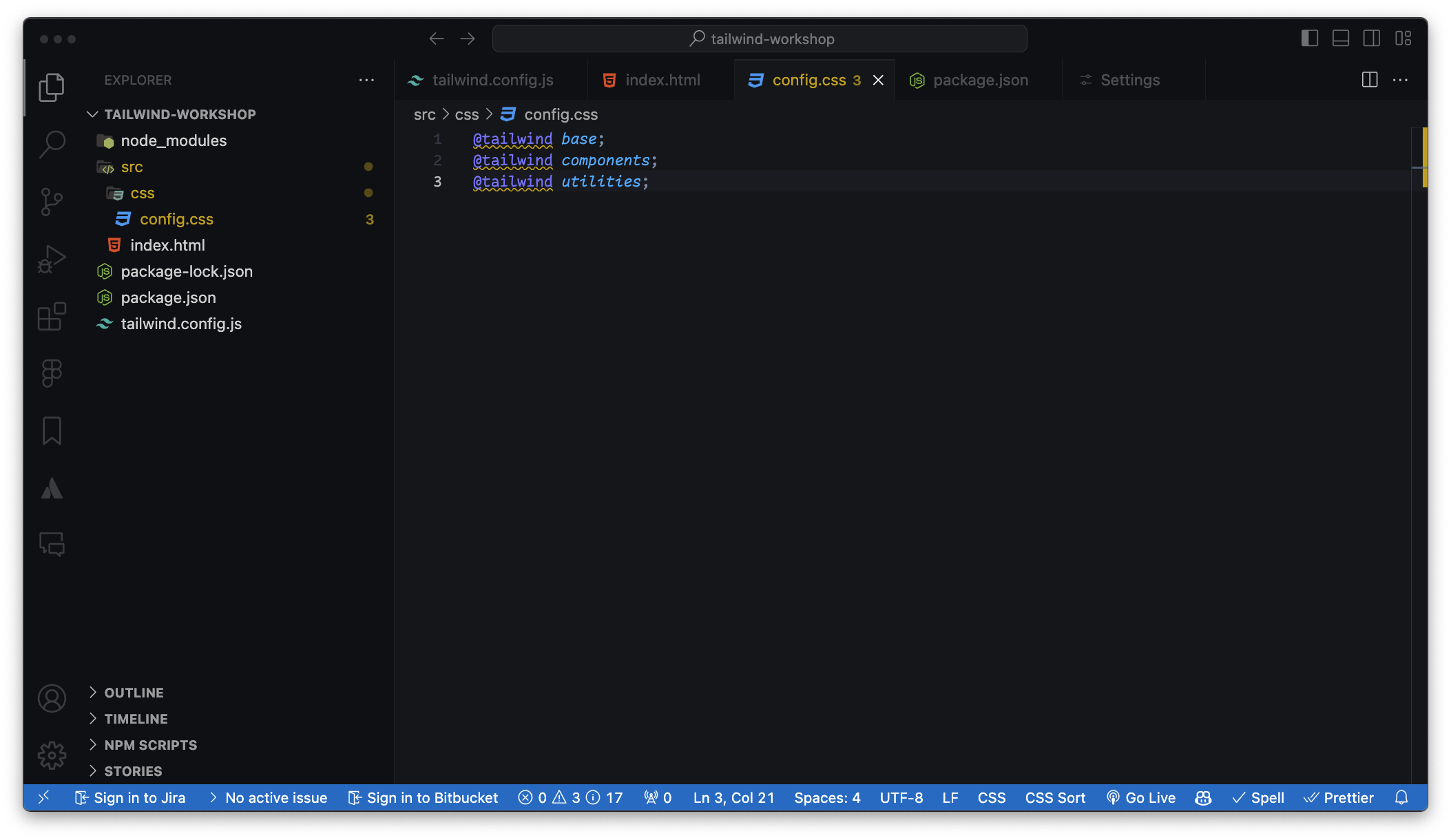
Crear carpeta CSS con las 3 directivas
@tailwind base;
@tailwind components;
@tailwind utilities;
npx tailwindcss -i ./src/input.css -o ./src/output.css --watchNuevo script en el package.json
Las rutas las carga el diablo
--watch 👀content: ["./src/**/*.{html,js}"]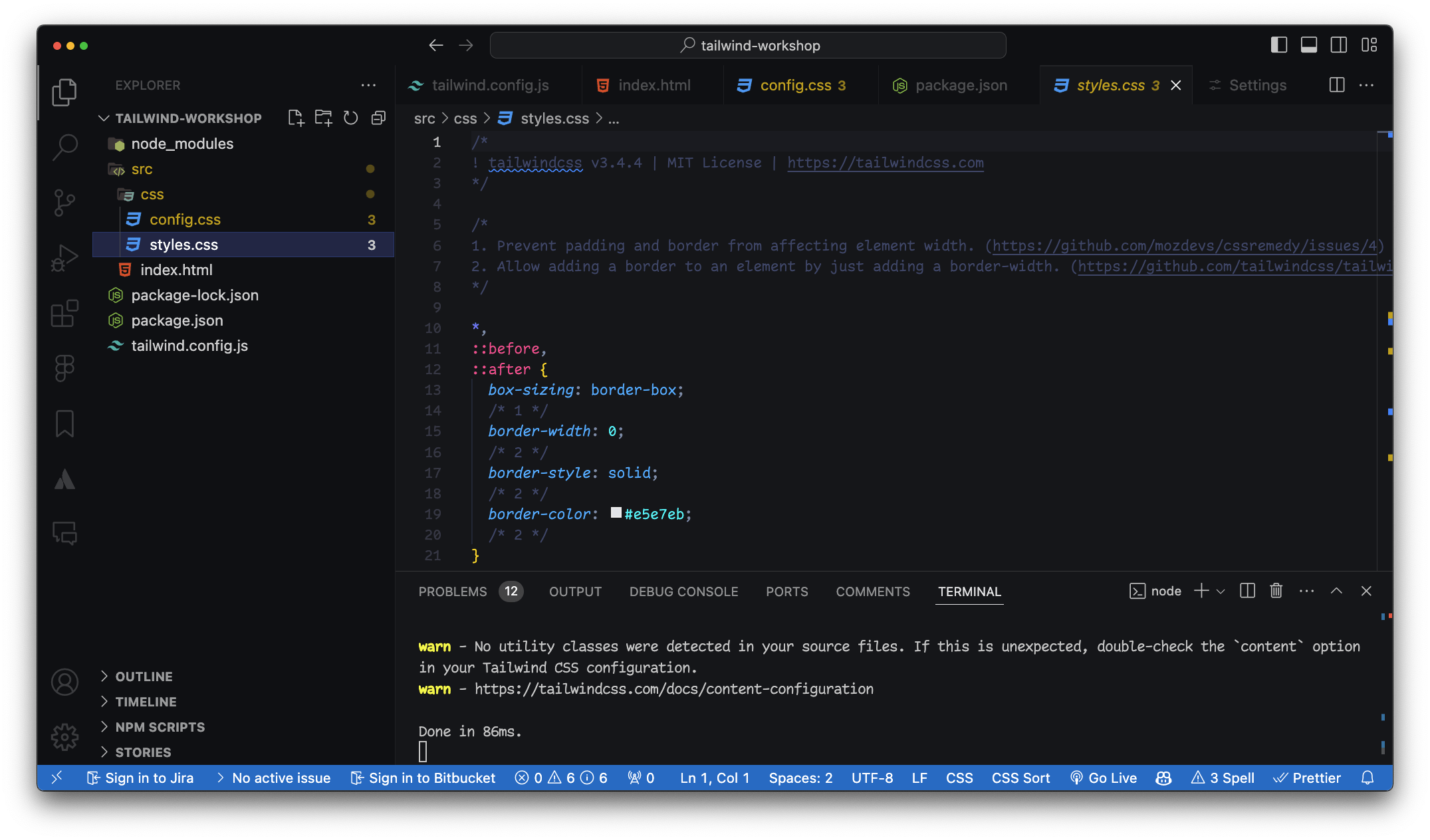
Estilos de la directiva @base
<link rel="stylesheet" href="styles.css">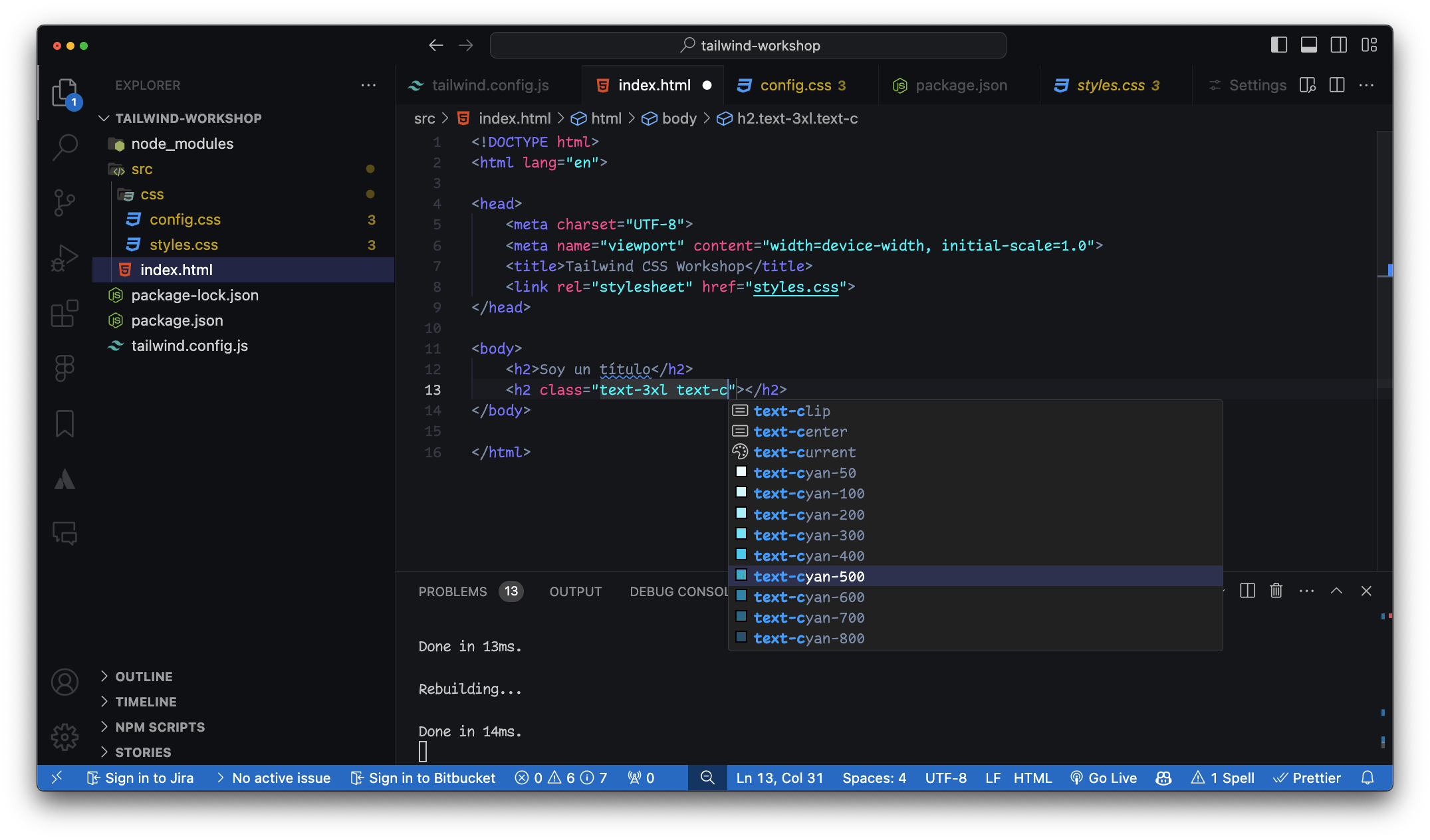
Módulos en Tailwind
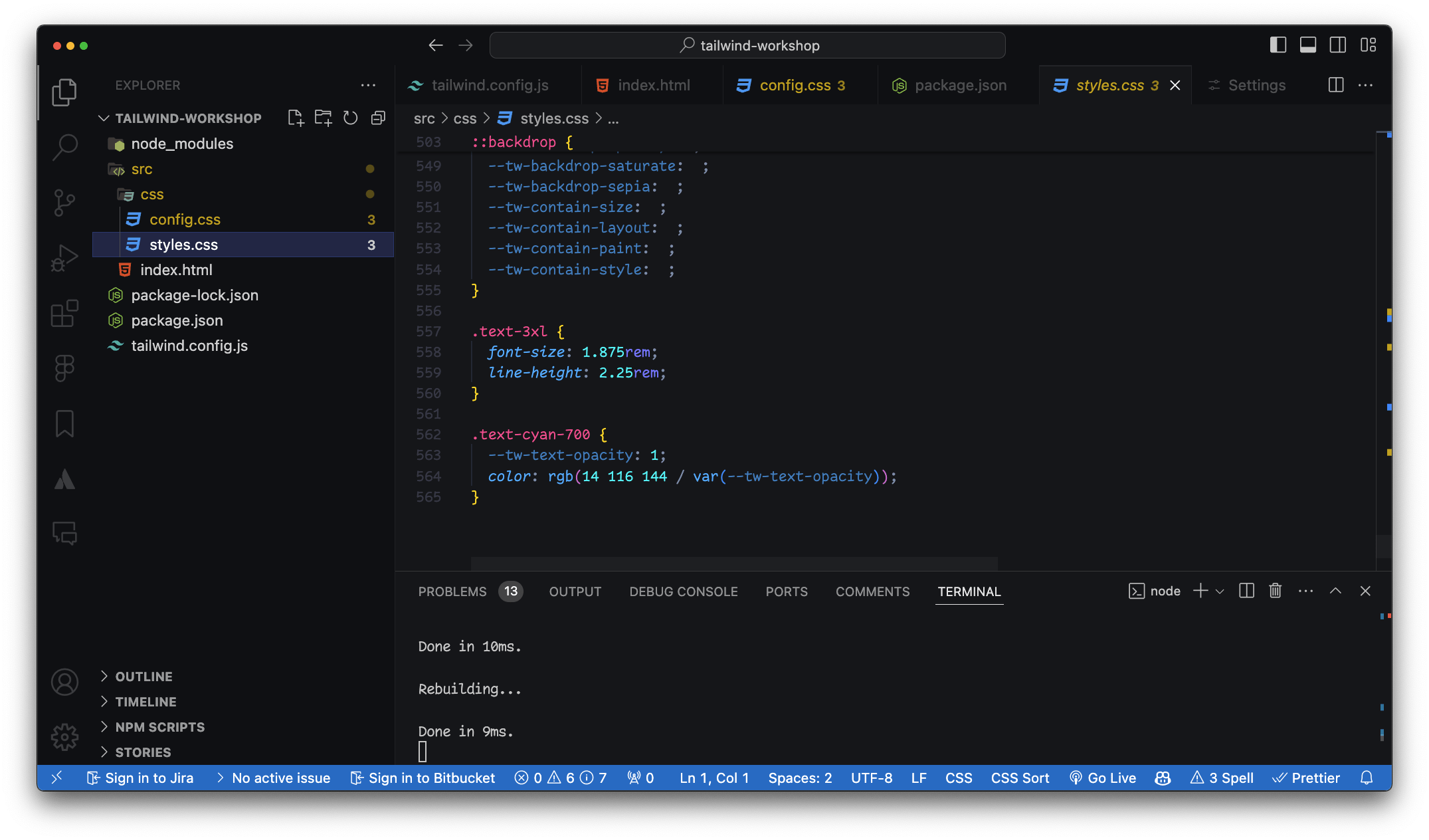
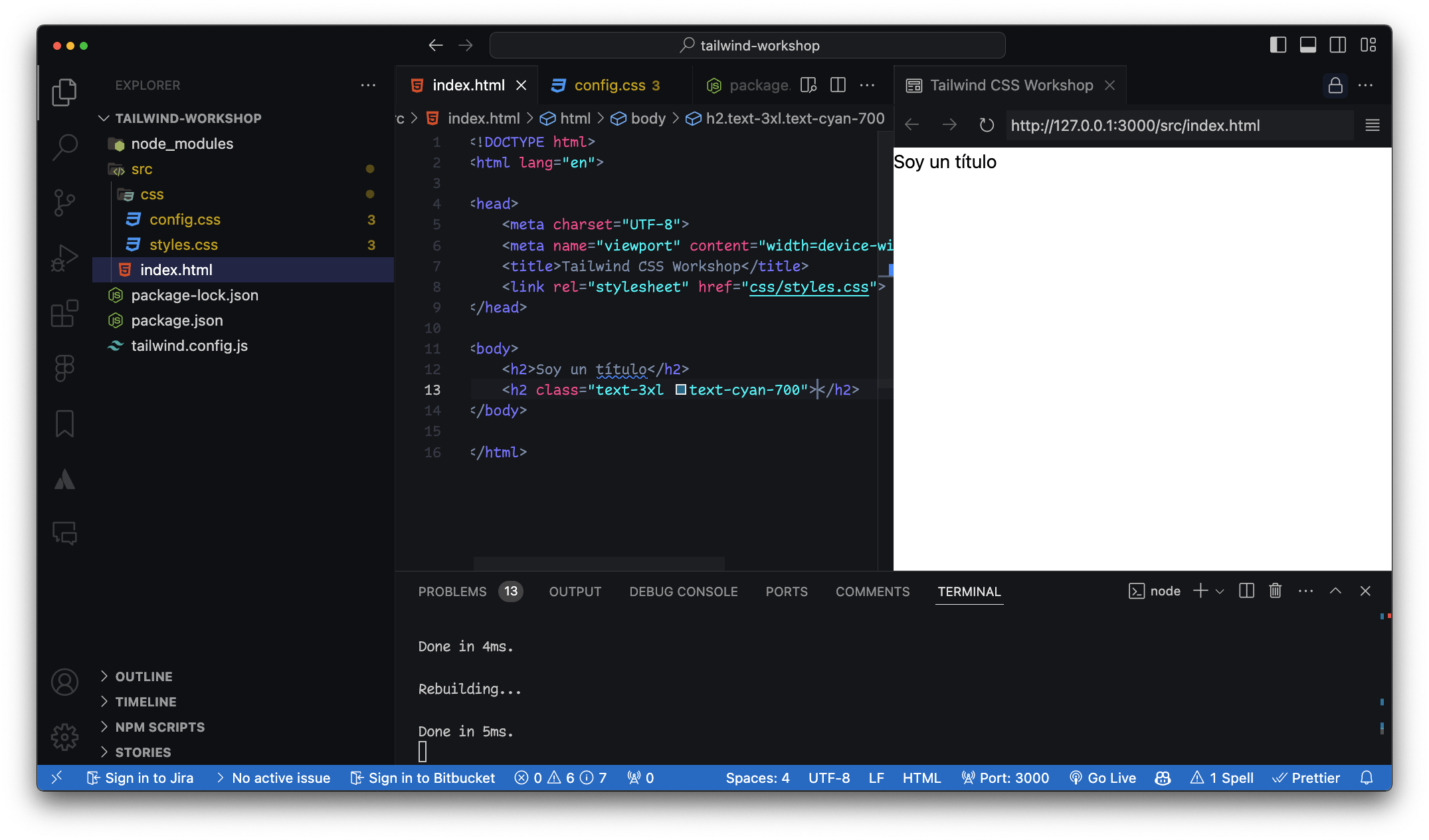
Clases de Colores
Definir un valor personalizado
¿Cómo se personalizan los colores en Tailwind CSS?
class="text-[#DC2024]"class="text-[200px]"Definir un valor personalizado
Como background-color
class="bg-teal-700"class="bg-teal-700/60"class="bg-[patatablue]/80"Módulos en Tailwind
Clases de posición
class="static fixed absolute relative sticky"class="inset-0 inset-x-0 inset-y-0"Módulos en Tailwind
Sistema de espaciado
Sufijo 1 == 4px0 al 96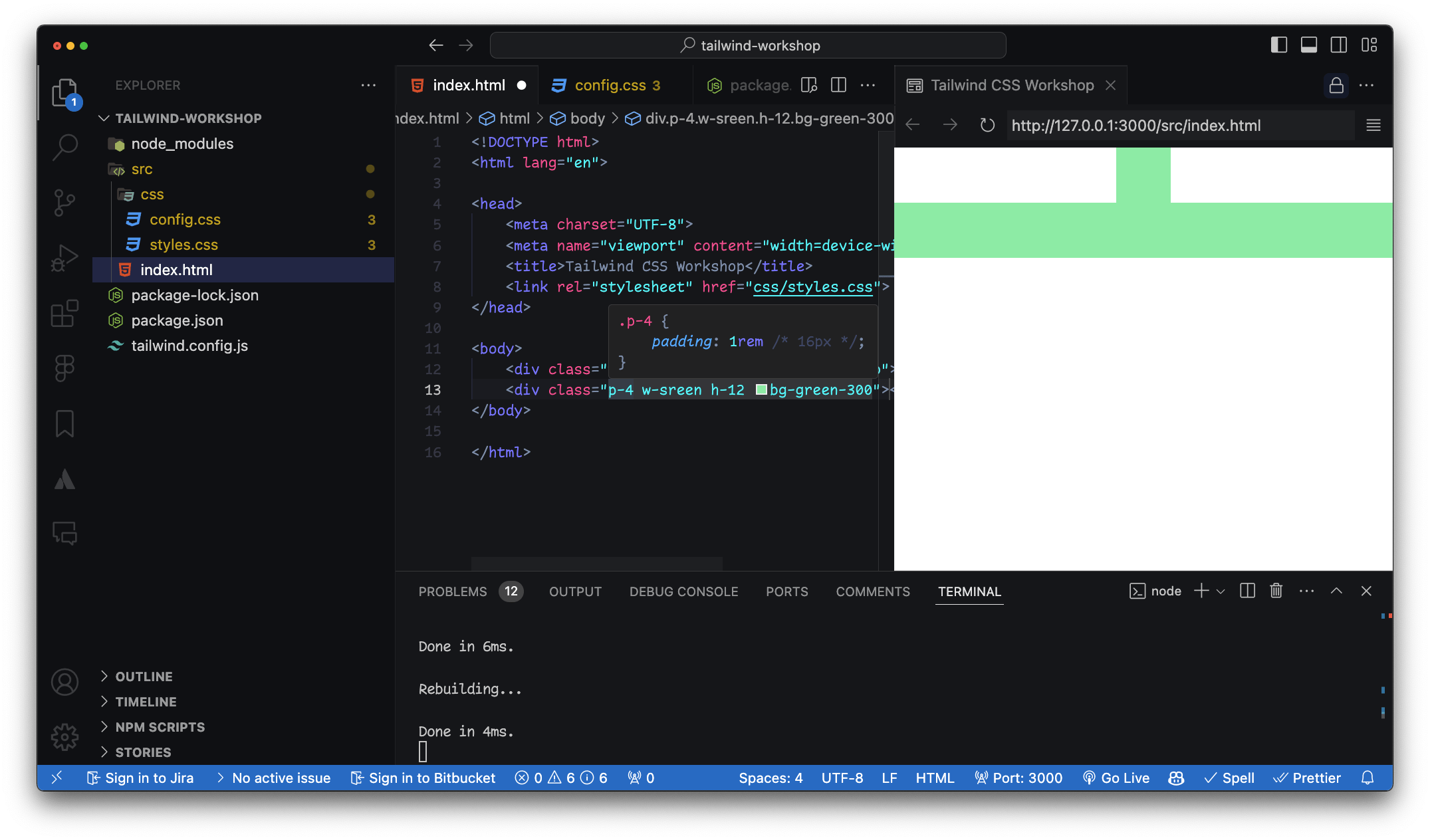
w-[202px].w-screen {
width: 100vw;
}
.h-screen {
height: 100vh;
}
.w-1/2 {
width: 50%;
}Sufijos extra
auto - auto
min - min-content
max - max-content
fit - fit-content
screen - 100vw / 100vh
full - 100%Demo
Interactividad avanzada
<section class="p-8 bg-green-400 group/section">
    <figure class="w-72 h-80 relative top-24 left-16 overflow-hidden group/figure">
        <p class="absolute inset-0 text-black bg-green-600/60 flex items-center justify-center font-semibold text-2xl z-20
        group-hover/figure:translate-y-0
        group-hover/section:bg-yellow-600/50
        transition">Este es un texto</p>
        <img src="<https://via.placeholder.com/150>" class="w-full h-full object-cover relative" id="img">
    </figure>
</section>
<section class="p-8 bg-green-400 group/section"><figure class="w-72 h-80 relative top-24 left-16 overflow-hidden group/figure"><p class="absolute inset-0 text-black bg-green-600/60 flex items-center justify-center font-semibold text-2xl z-20
group-hover/figure:translate-y-0
group-hover/section:bg-yellow-600/50
transition">Este es un texto</p><img src="<https://via.placeholder.com/150>" class="w-full h-full object-cover relative" id="img">Group modifiers
Desglose
<figure class="w-72 h-80 relative top-24 left-16 overflow-hidden group/figure"><p class="absolute inset-0 text-black bg-green-600/60 flex items-center justify-center font-semibold text-2xl z-20
group-hover/figure:translate-y-0
group-hover/section:bg-yellow-600/50
transition">Este es un texto</p>
Cómo funciona
Definición del Grupo Modificadores de Grupo
<section class="group bg-green-400 p-8">
    <div class="relative overflow-hidden group-hover:bg-blue-600">
        <p class="text-white absolute inset-0 flex items-center justify-center
           transition transform translate-y-full group-hover:translate-y-0">
            Este es un texto
        </p>
        <img src="<https://via.placeholder.com/150>" class="w-full h-full object-cover">
    </div>
</section>
Ejemplo simplificado
Dudas
Prácticas
Pregunta 1:
¿Cómo se personalizan los colores en Tailwind CSS?
/** @type {import('tailwindcss').Config} */
theme: {
    extend: {
      fontFamily: {
        "display": ['"Arial", "sans-serif"'],
        "marca": ['"Poppins", "sans-serif"'],
      },
      colors: {
        "carmen-primary": "#FF6363",
        "carmen-secondary": {
          100: "#E2E2D5",
          200: "#888883",
        },
      },
    },
  }
<!-- index.html -->
<div class="bg-primary text-secondary p-4">
Custom Colors
</div>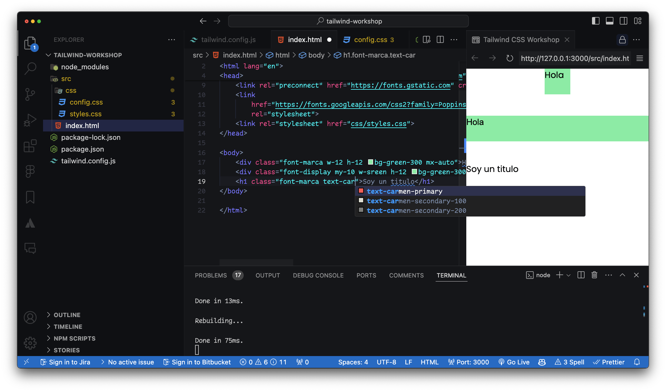
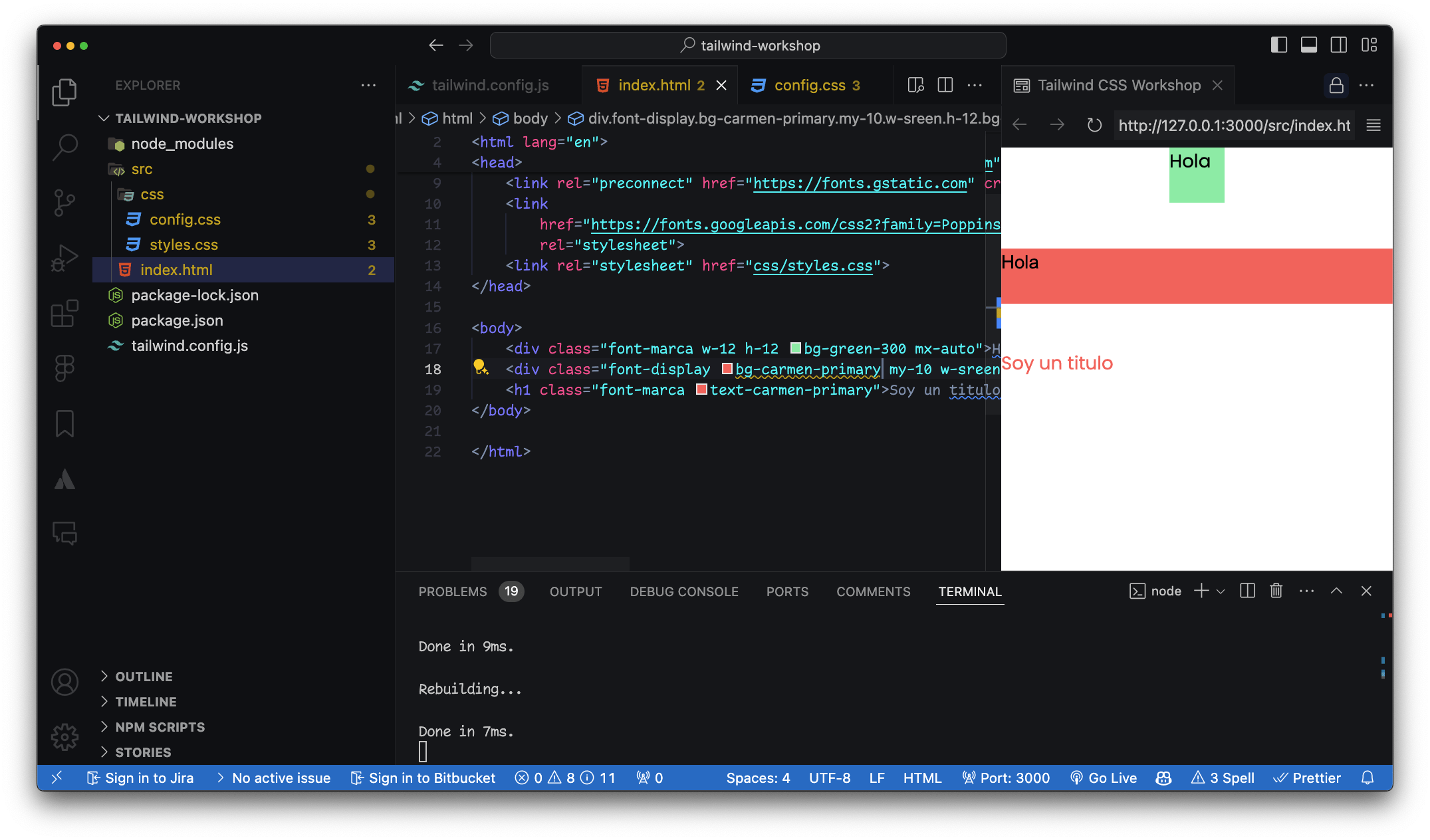
¿Y si quiero agregar un nuevo valor?
Puedes agregar nuevos valores a las propiedades / clases de utilidad
Pregunta 2:
¿Cómo se crean clases personalizadas en Tailwind CSS?
La directiva @apply
En nuestro archivo CSS
/* input.css */
.btn-custom {
  @apply bg-primary text-white py-2 px-4 rounded-lg shadow-lg;
}
<!-- index.html -->
<button class="btn-custom">
  Custom Button
</button>
Pregunta 3:
¿Cómo se maneja el diseño responsive en Tailwind CSS?
Layout
CSS Grid y Flexbox
<!-- index.html -->
<div class="bg-blue-500 p-4 sm:bg-green-500 md:bg-red-500 lg:bg-yellow-500 xl:bg-purple-500">
  Responsive Box
</div>class="w-[90%]"Pregunta 4:
¿Cómo se añaden transiciones y animaciones en Tailwind CSS?
<!-- index.html -->
<button class="bg-blue-500 text-white py-2 px-4 rounded transition duration-500 ease-in-out transform hover:bg-red-500 hover:scale-105">
  Hover me
</button>
Pregunta 5:
¿Cómo se instalan y utilizan plugins en Tailwind CSS?
// tailwind.config.js
module.exports = {
  plugins: [
    require('@tailwindcss/forms'),
    require('@tailwindcss/typography'),
  ],
}
Pregunta 6:
¿Cómo puedo utilizar valores personalizados para tamaños en Tailwind CSS?
// tailwind.config.js
module.exports = {
  theme: {
    extend: {
      spacing: {
        '72': '18rem',
        '84': '21rem',
        '96': '24rem',
      },
    },
  },
}
<!-- index.html -->
<div class="w-72 h-84 bg-gray-200">
Custom Spacing
</div>Pregunta 7:
¿Cómo puedo aplicar estilos condicionales para diferentes estados de un elemento (hover, focus, etc.)?
<!-- index.html -->
<input class="border-2 border-gray-300 focus:border-blue-500 focus:outline-none" type="text" placeholder="Focus me">
Pregunta 8:
¿Cómo puedo gestionar el responsive design con Tailwind CSS utilizando breakpoints específicos?
<!-- index.html -->
<div class="text-sm sm:text-base md:text-lg lg:text-xl xl:text-2xl">
  Responsive Text
</div>
Pregunta 9:
¿Cómo se manejan las clases de utilidad para el grid en Tailwind CSS?
<!-- index.html -->
<div class="grid grid-cols-3 gap-4">
  <div class="bg-blue-500 p-4">1</div>
  <div class="bg-green-500 p-4">2</div>
  <div class="bg-red-500 p-4">3</div>
</div>
media queries
Repaso en la documentación
@layer components {
    .btn {
        @apply bg-blue-500 text-white font-bold py-2 px-4 rounded;
    }

    .my-area {
          grid-template-areas:
          "header"
          "navigation"
          "social-media"
          "logo"
          "footer";
      }

      .my-area-md {
          grid-template-areas:
          "logo           header      navigation"
          "social-media   navigation  footer"
          ;
      }
}
Pregunta 10:
¿Cómo se incluyo una fuente custom en Tailwind CSS?
¿Y los estilos de fuente?
Tailwind sólo tiene 3 clases para font-family
<link rel="preconnect" href="https://fonts.googleapis.com">
<link rel="preconnect" href="https://fonts.gstatic.com" crossorigin>
<link href="https://fonts.googleapis.com/css2?family=Poppins:ital,wght@0,100;0,200;0,300;0,400;0,500;0,600;0,700;0,800;0,900;1,100;1,200;1,300;1,400;1,500;1,600;1,700;1,800;1,900&display=swap" rel="stylesheet">
/** @type {import('tailwindcss').Config} */
module.exports = {
content: ["./src/**/*.{html,js}"],
theme: {
extend: {
fontFamily: {
"display": ['"Arial", "sans-serif"'],
"marca": ['"Poppins", "sans-serif"'],
}
},
},
plugins: [],
}Material UI
Como dependencia en el proyecto
Repositorio